Critiquing the NSA to meet student needs

Currently we're doing statistics and graphing in class, and I've enjoyed putting challenging visuals and infographics in front of students, and getting them to consider and critique them.
I've used the wonderful Information is Beautiful site, in particular the really mind blowing Billion-Dollar-O-Gram. The 'Mountains out of Molehills' interactive was a challenge to their knowledge of recent history. In particular the gap at the September 2011 period took a while to sink in.
The 'SnakeOil' visualisation confused quite a few, for the sheer scale of it, but many were really intrigued by the manner in which very complex data was represented. Each of the graphs produced interesting conversation and a chance to tell a story.
I shared Keith Ng's fantastically engaging NZ Budget 2013 the day after the actual budget announcement. His work got 11 year olds interested in all that stuff that politicians and newspapers talk about. Their reactions when they saw who was getting less money, in relation to the overall pot, were intuitive and honest. For obvious reasons, they were particularly interested in the education section, and the design of the graphics, gave us the opportunity to discuss what each of those small boxes represented in real life. And what those figures actually represented.
I've made it clear that all of these are very complex and challenging infographics, and that it was OK to be confused initially. But I encourage my students to see them as telling a story, that we can read and consider. Each of the graphics allows us to notice things, and to wonder about the issues outlined in them.
The challenge to students has been to make valid statements based on what data is directly on display in front of them. All of these visualisations have the collected data behind them, and being able to show those datasets to students is important, so they don't just see the visuals as an exercise in making pretty pictures.
Lastly I've tapped into excellent blog from Auckland University Stats Chat - for my own learning, but also for the odd tidbit to put in front of my students. This Ignite talk from Noah Iliinsky entitled, "Data Viz: You're Doin' it Wrong" - was much enjoyed.
Finally today I presented the rather topical images from the PRISM powerpoints, as presented by the Guardian and the Washington Post, but also roundly blasted by Edward Tufte.
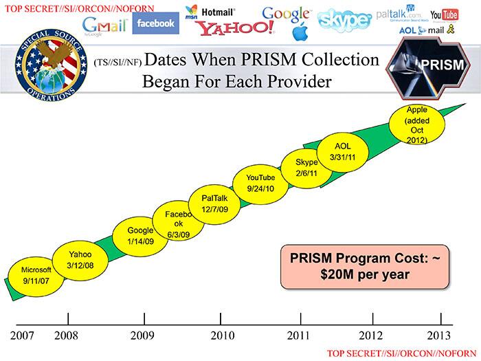
Does the nsa commission 5th graders to draft their power point presentations. What is this y-axis? pic.twitter.com/dJmhxVG8ua
— Evelyn Rusli (@EvelynRusli) June 7, 2013
I'm glad to say, my 11 and 12 year olds could point out quite a few errors, including the y-axis.
Image credit: By Laura Poitras / Praxis Films, CC BY 3.0, https://commons.wikimedia.org/w/index.php?curid=27176492
